Visit the website: www.lavarchitecture.com
LAV is an architecture company and their website was designed and developed by me as a designer and front-end developer. The goal was to inform visitors and facilitate easy navigation to find interesting projects.The entire website was created from scratch using HTML, CSS, and JavaScript, allowing me to have complete control over the design and functionality.
Design and development of a website that will inform visitors about studio's work
January 2022 - June 2022 | 6 months
LAV Architecture
Individual Project
Figma, HTML, CSS, JS
Visit the website: www.lavarchitecture.com
After engaging in a thorough discussion with the architect, I gathered the necessary information and discussed their expectations, goals, and requirements for the website. This initial consultation allowed me to gain a comprehensive understanding of their vision, enabling me to commence the planning phase for the website's design.
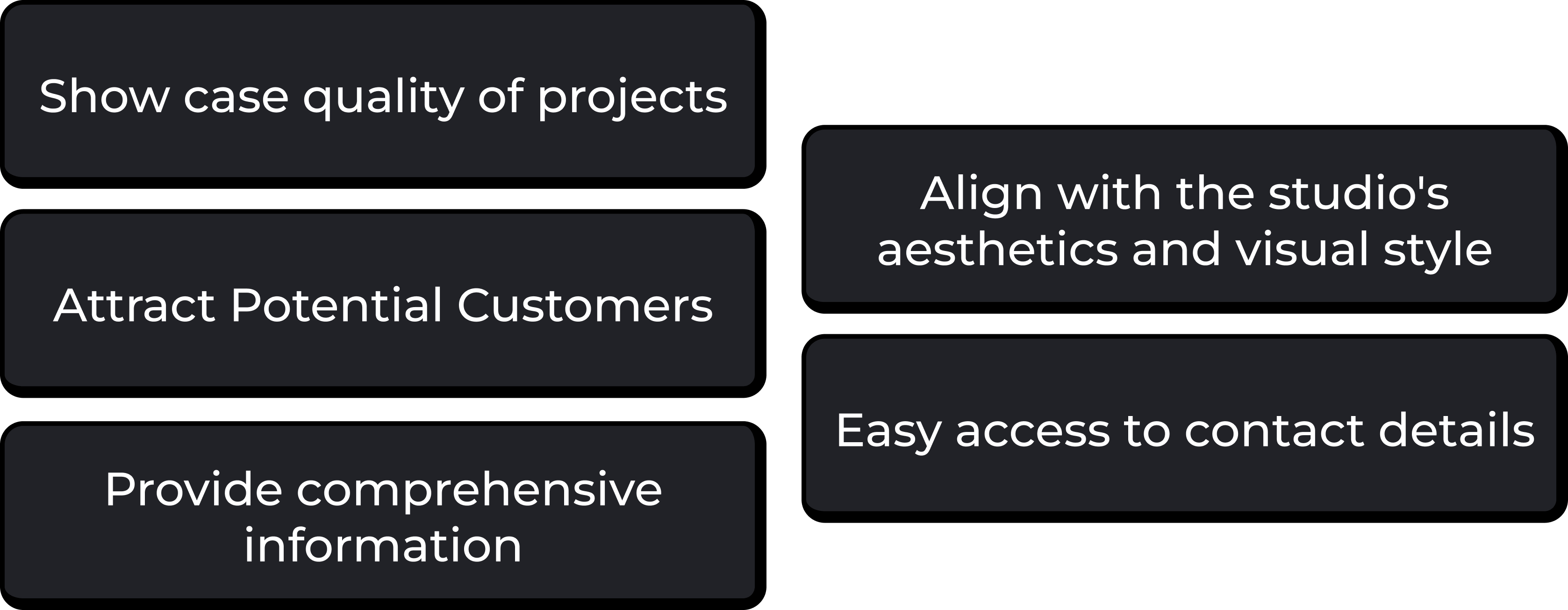
The purpose of the website is to serve as a digital platform that showcases the studio's work, attracts potential customers, and provides essential information. It aims to create a strong online presence and act as a valuable marketing tool.
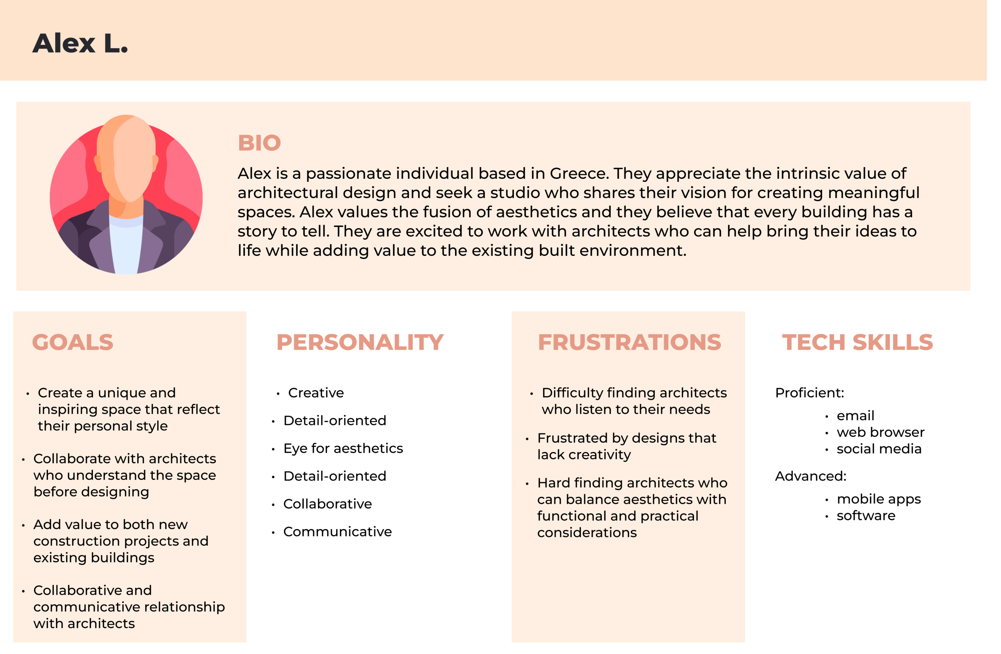
To create effective content, I thoroughly examined the architect's core audience. I identified their specific needs and created a persona that reflected their characteristics. This provided valuable insights into their preferences, allowing me to tailor the content and design choices accordingly.
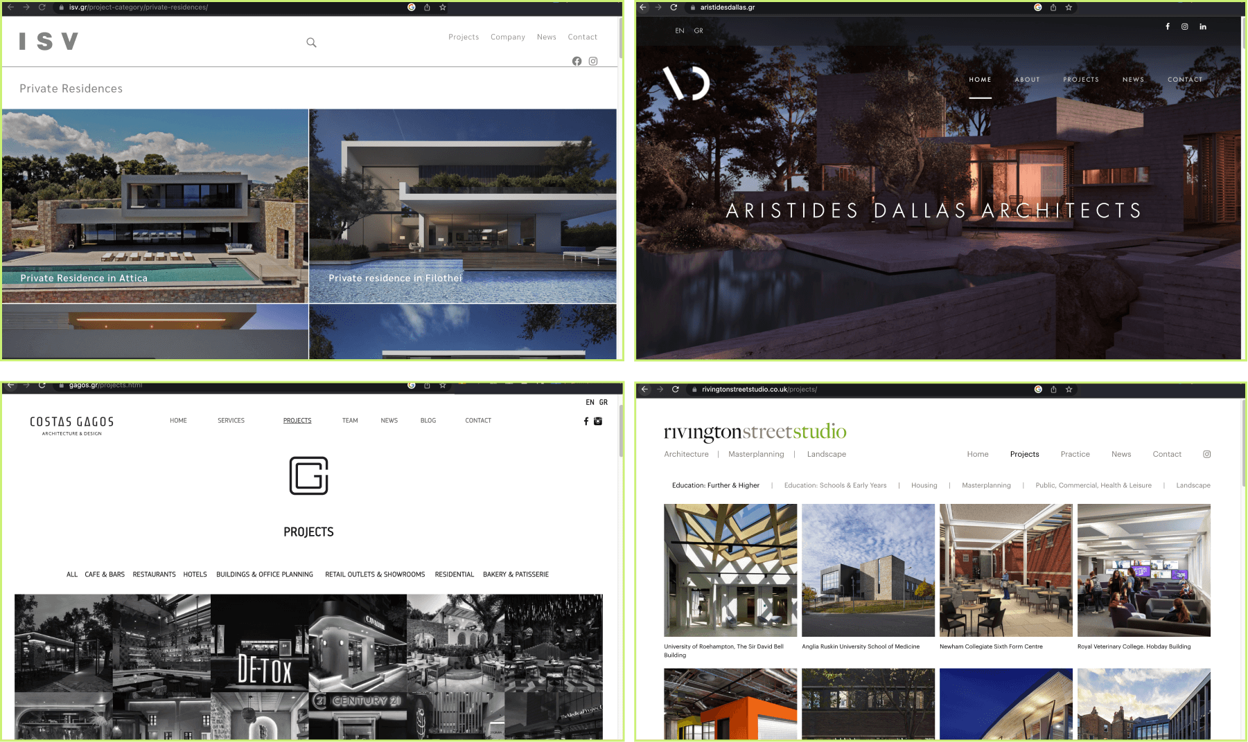
Competitor analysis was integral in the creation of the website. Working closely with the client, we conducted a comprehensive analysis of competitors' websites before, during, and after the design phase. This process provided valuable insights into design trends, user experience practices, and industry standards.
By examining how competitors present themselves, we gained a clear understanding of their positioning. This knowledge empowered us to strategically position the website and services offered by LAV in a distinctive and captivating manner that resonates with the target audience.
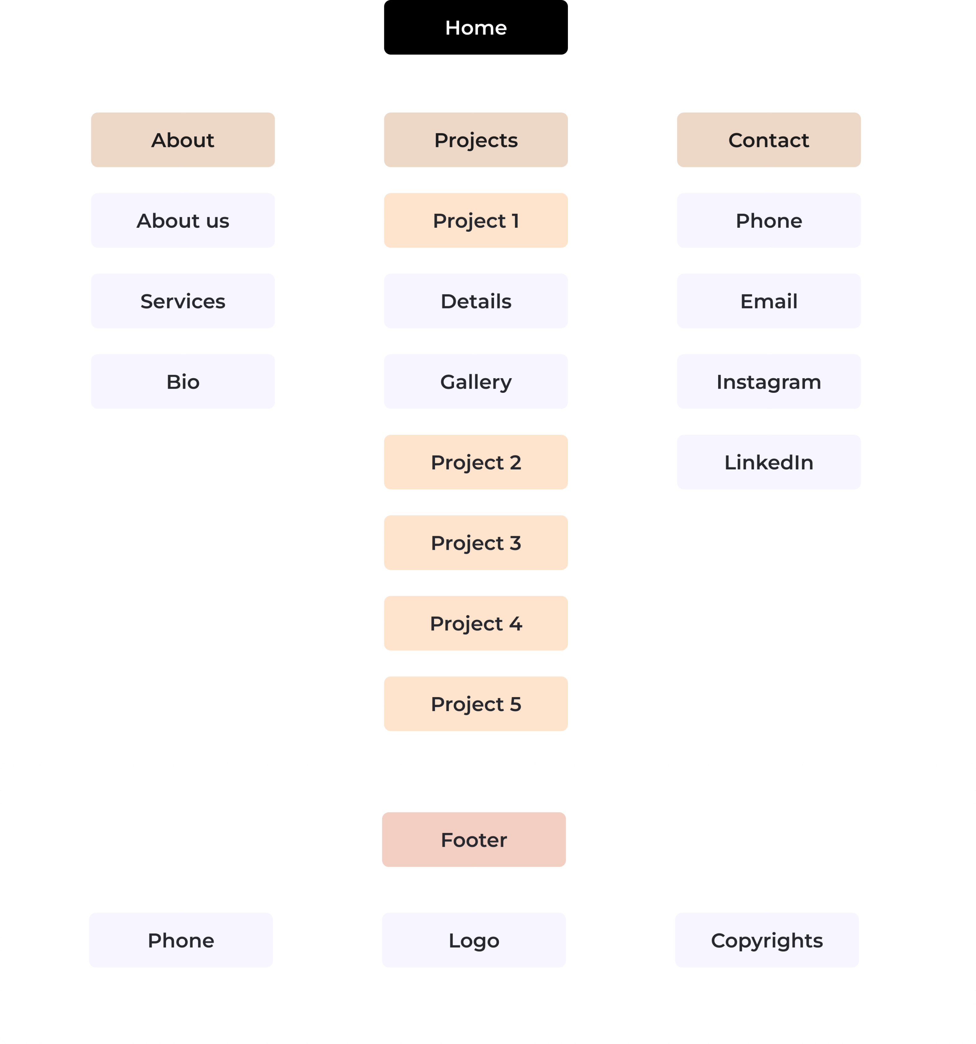
After gathering all the required information, I proceeded to develop a sitemap. This visual represenation of the website enabled me to conceptualize the user's path, demonstrating how they can effortlessly navigate between pages. My objective was to guarantee an attractive and user-friendly website that delivers an intuitive browsing experience.
Considering that the website's visitors are individuals seeking architects to collaborate with, utmost attention was given to the design and aesthetics. The primary focus was to create a website that is user-friendly, ensuring a seamless and valuable experience for the visitors.
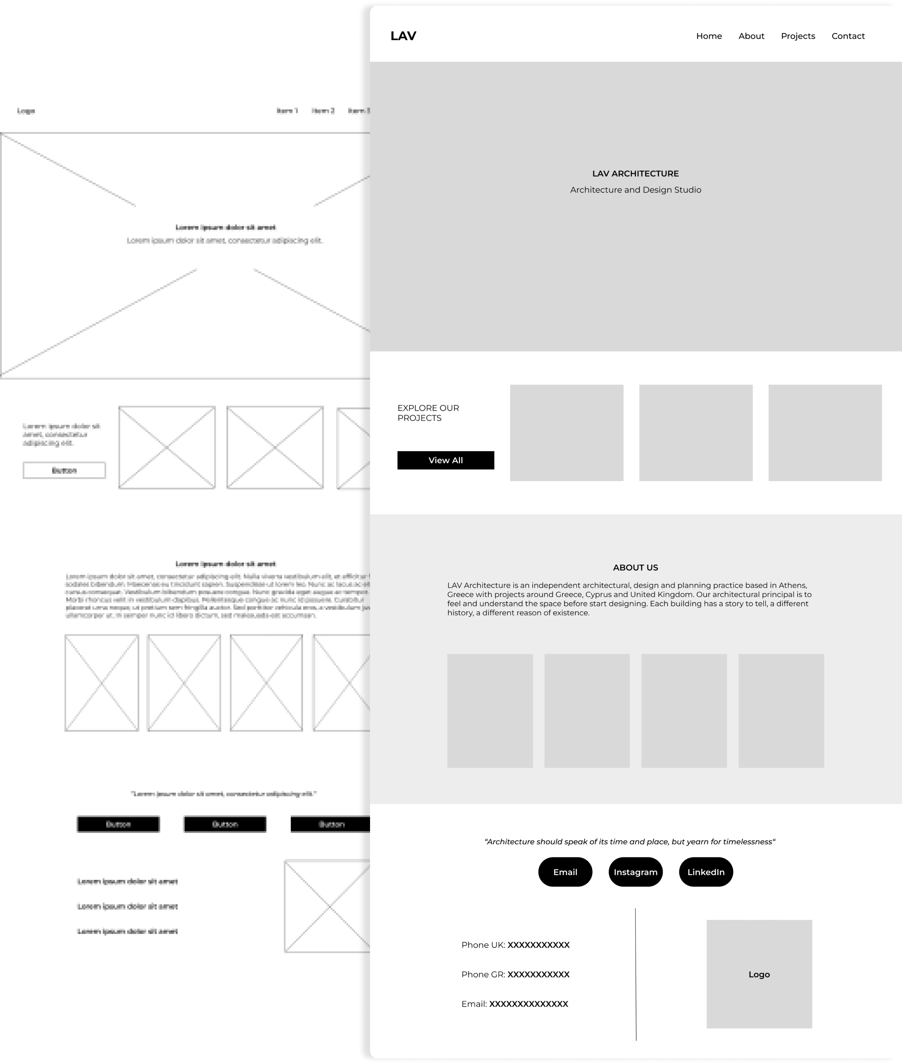
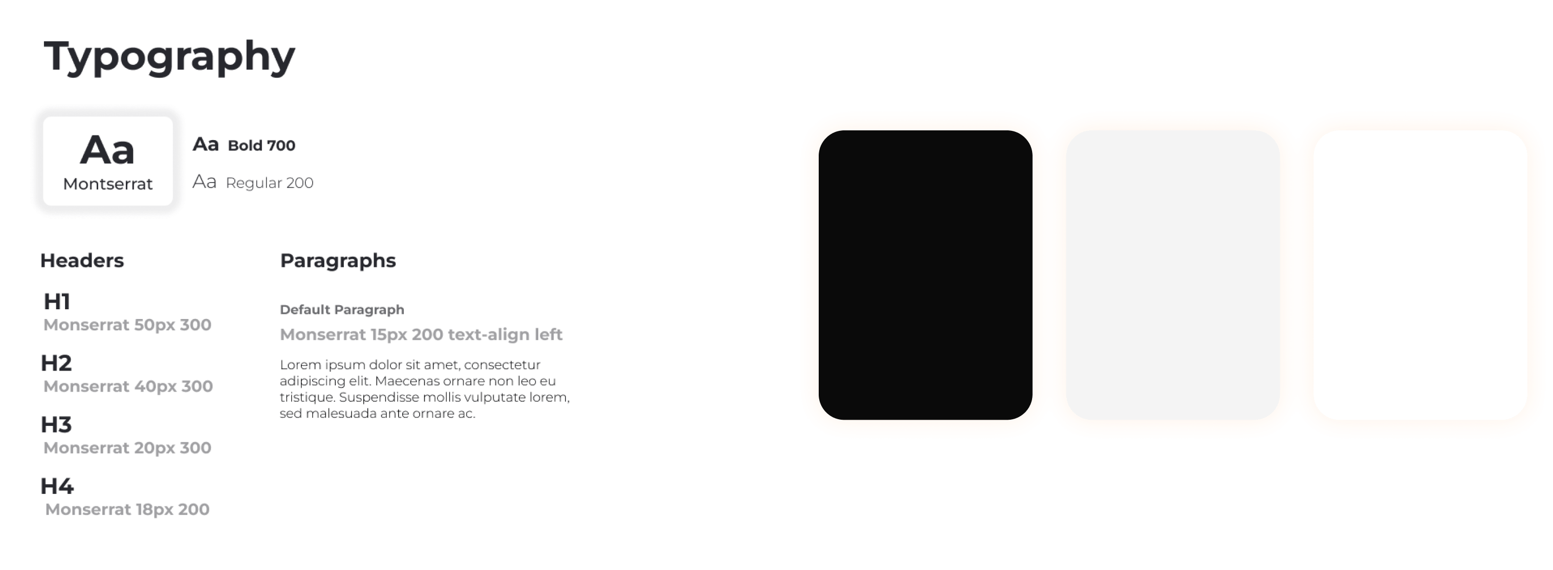
To align the website's aesthetics with the studio's identity and attract visitors, I actively engaged with the client. By reviewing their project images, I understood their preference for minimalistic designs blending modern and traditional elements, emphasizing quality. Using this insight, I created wireframes to present initial concepts. Upon approval, I refined them into mid-fidelity mockups, collaborating closely with the client to capture the desired aesthetic accurately. With approved mockups, I developed a minimalistic color palette and typography guide in line with the studio's identity. We agreed on text styles and imagery. To ensure client satisfaction, high-fidelity mockups were created using Figma. This meticulous process guarantees the website design reflects the studio's aesthetics and meets the client's vision before entering the development phase.
Collaboratively with the client, we finalized the mockups and refined the website's content. Subsequently, I embarked on building the website from scratch using HTML, CSS, and JavaScript, ensuring a custom and tailored solution.
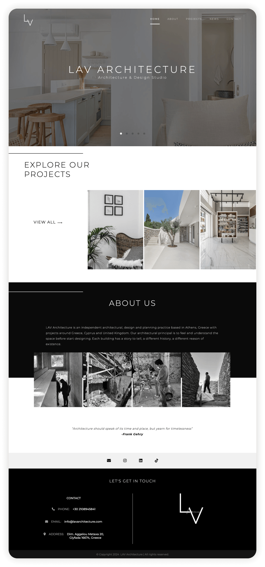
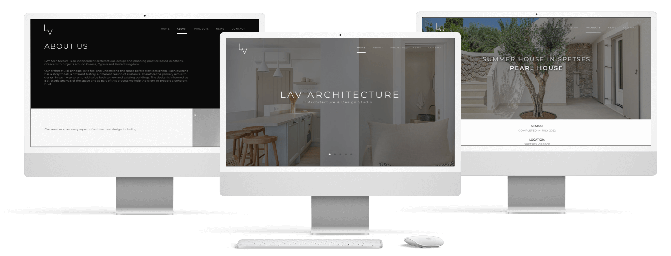
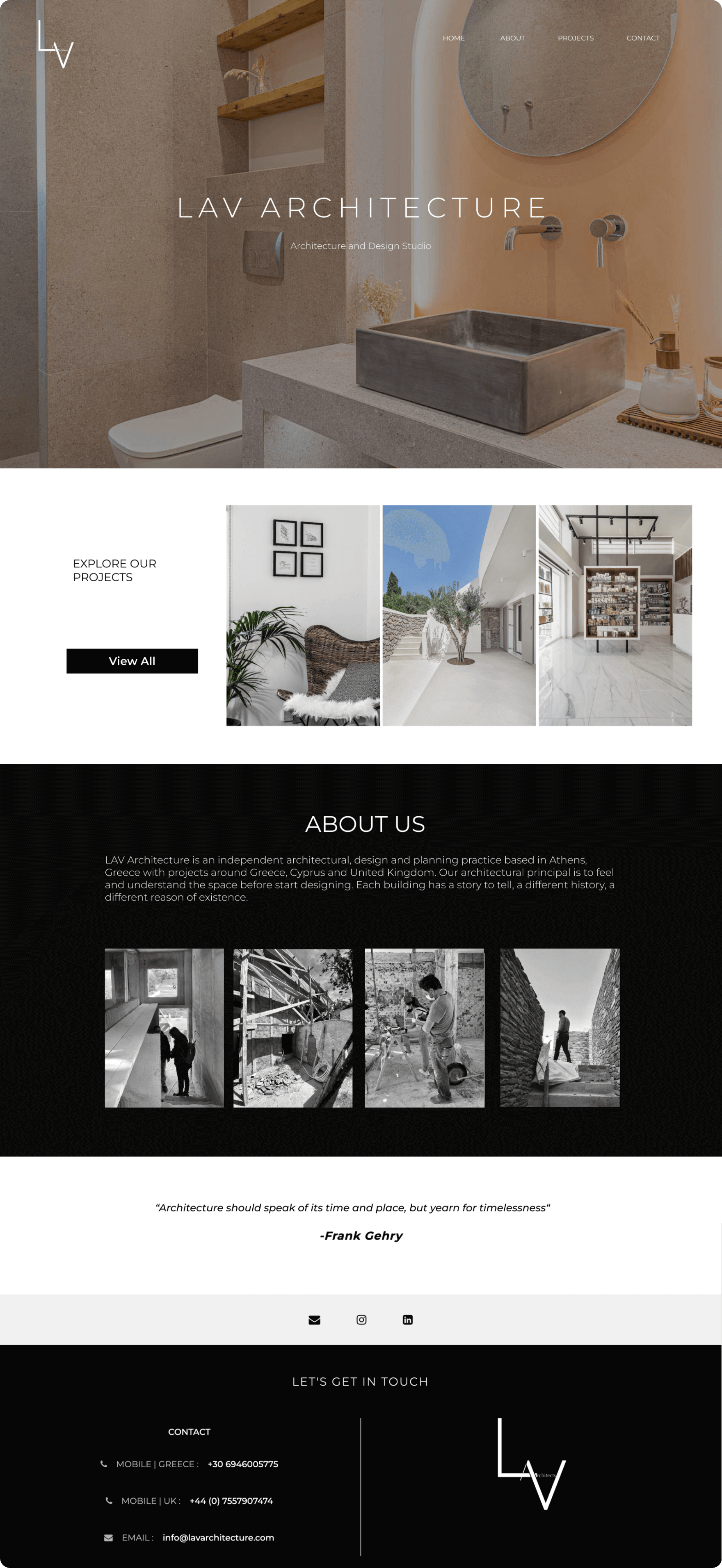
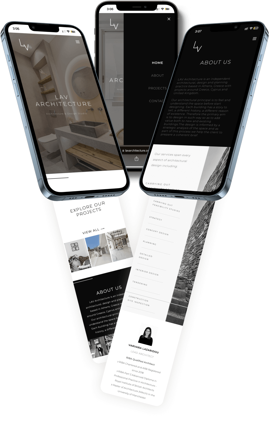
The Home Page serves as the first touch-point for visitors, offering a welcoming and visually engaging introduction to the studio. It immediately conveys the studio's aesthetic and professional standards. Users are encouraged to explore the studio’s projects, with prominently displayed contact information and branding ensuring easy access for potential clients.
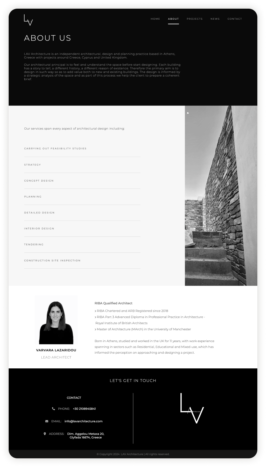
The About Us Page showcases the studio's mission, services, and expertise in a clean, minimalist layout. A brief introduction, a list of services, and a professional head-shot of the lead architect add clarity and a personal touch, building trust and highlighting qualifications. The page is designed to connect with users while emphasizing the studio’s professionalism
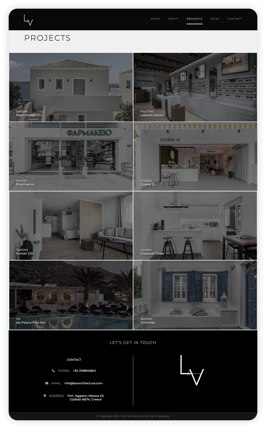
The Projects Page is designed to act as a digital portfolio, showcasing the studio’s diverse range of completed projects. A grid-based layout presents projects visually, with thumbnail images that allow users to quickly browse. Each project includes a title, giving users immediate context. The design focuses on simplicity and navigation ease, ensuring users can effortlessly explore projects of interest.
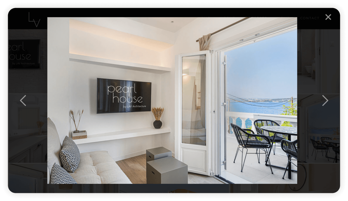
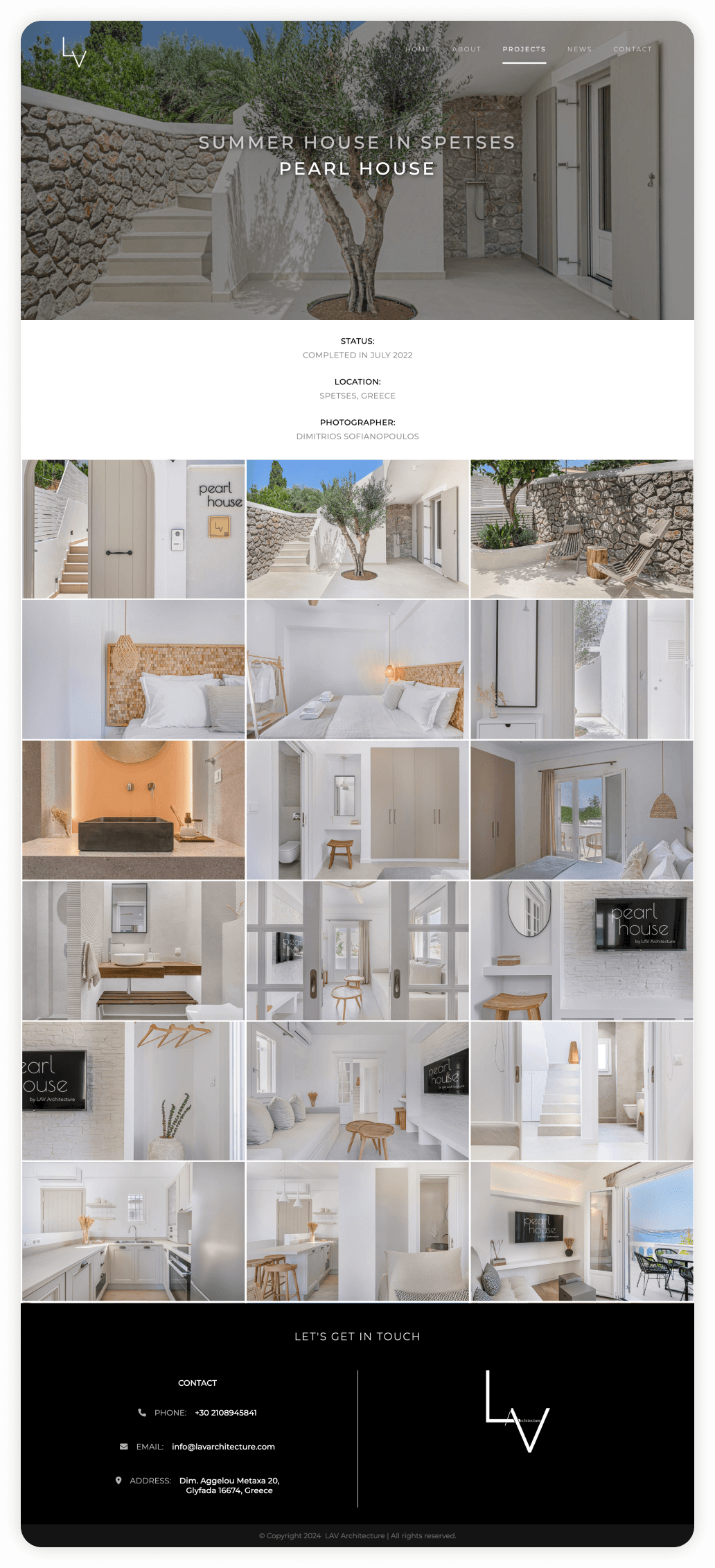
This page highlights the details of a single project, featuring key information and a dynamic gallery with a curated selection of high-quality images that showcase the project’s design elements and details. Users can click on images to enlarge them, making it easy to focus on the design details. The clean and distraction-free interface ensures that the images are the primary focus, with intuitive navigation to browse through the gallery. The layout is designed to present both visuals and information in a balanced and easy-to-read format, allowing users to fully appreciate the project’s scope.
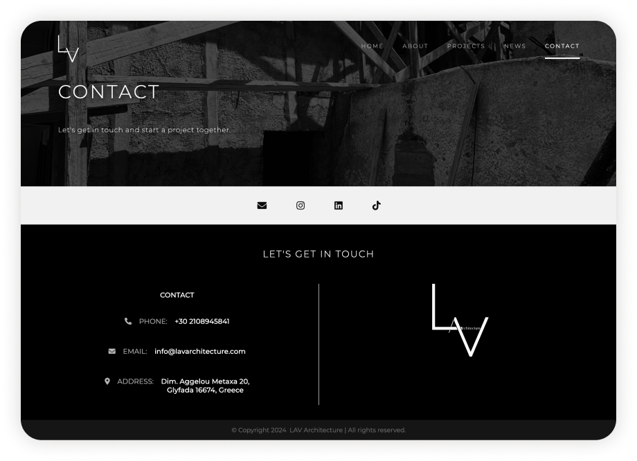
The Contact Page makes it easy for clients and collaborators to reach out. With a clean, professional layout, it features a bold header image, multiple contact options, and social media links, ensuring accessibility. The design reinforces the studio’s branding, creating a seamless and trustworthy experience for users ready to connect.
I prioritised responsiveness during the website development process, ensuring that it seamlessly adapts to various screen sizes. This approach guarantees that users can enjoy an exceptional and intuitive browsing experience regardless of the device they use.
Before going live, I thoroughly tested the website to ensure everything was running smoothly. This involved checking all the links and buttons, verifying the spelling and accuracy of the content, and ensuring consistent visuals across different screen sizes.
This project provided an exciting opportunity to delve into design principles specific to architectural websites. It allowed me to explore captivating methods of highlighting the studio's unique aesthetics, style, and identity, effectively aligning their digital presence with their remarkable work. Moreover, a key aspect of the design process was carefully considering information hierarchy. Striking the right balance between the content users are consuming and the content they desire, I ensured a seamless user experience and optimized engagement with the website.
Let's have a talk so you can learn more about my work!
© Copyright Ioanna Lazaridou | All rights reserved.