Final Screens
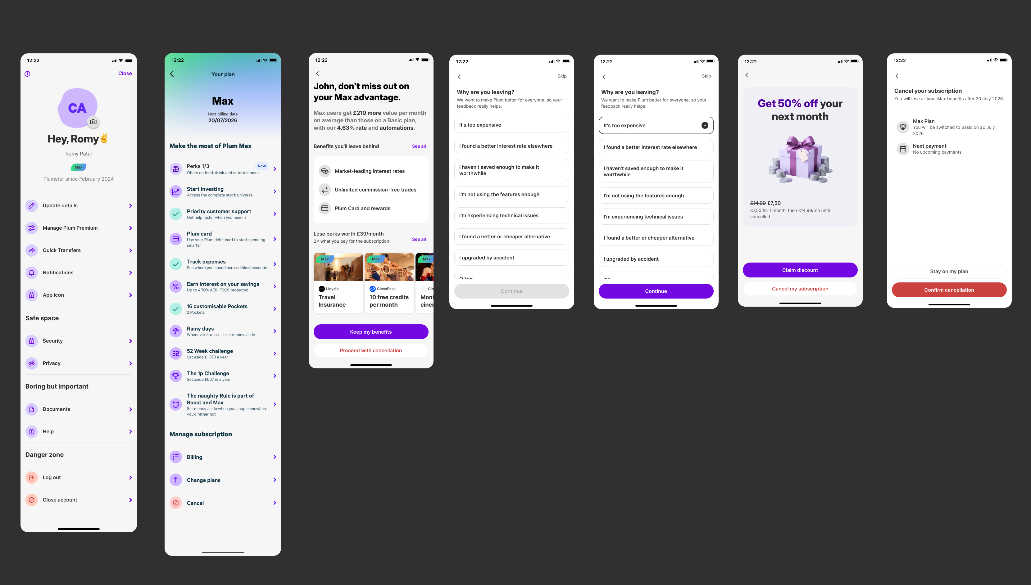
Plum's existing cancellation flow gave paid subscribers a binary choice: stay or leave, with no value context and no alternative in between. I redesigned it around a simple idea, help users understand what they're already getting, offer a lower-cost path where it fits, and leave transparently if cancelling is still the right call.
Reduce preventable churn from Plum's paid tiers by replacing a blunt cancellation prompt with tier-specific value reminders, a downgrade alternative, and structured feedback capture, without resorting to friction or dark patterns
2 weeks
Plum
Product Designer
Figma, FigJam
The old flow was a one-line "are you sure?" prompt: no value context, no alternative to leaving, and no way to capture why someone was going. Internal data pointed to two solvable causes behind most cancellations: cost sensitivity and unused features, not dissatisfaction with the product itself.
Cancellation isn't necessarily a retention problem, for a meaningful share of users, it's a value-awareness problem. Some weren't leaving because Plum had stopped being worth it; they were leaving because they'd lost sight of what they were already getting. That reframing is what shaped the whole flow.
How might we help users make an informed decision about their subscription, by showing the value they're already receiving and offering a flexible alternative, so they don't cancel impulsively out of cost concern or forgotten value?
The value of Plum isn't visible at the exact moment users consider leaving, and an unoptimised cancellation flow gives them nothing to weigh it against.
How might we surface real value and a flexible alternative, so users don't cancel impulsively before making an informed decision?
If users see relevant value reminders and are offered an appropriate lower-cost alternative, fewer will complete cancellation, and every exit becomes structured product data.
Before any screens, I aligned engineering, product, and commercial teams on one document: context, success metrics, user needs, and business goals.
No optimised cancellation flow existed, users could cancel directly without understanding what they'd lose or seeing any alternative. Graceful, industry-standard flows typically soften the exit with reminders, downgrades, or pauses rather than a hard stop.
Deflect avoidable cancellations with tier-specific value reminders and a targeted downgrade path, while capturing clean churn data, using static tier averages instead of personalised, real-time calculations to keep engineering lift low.
Rather than full personas, I worked from three cancellation motivations grounded in internal churn data, each shaping the content and branching logic of the flow differently.
Pro/Ultra · cost-sensitive
Premium/Max · subscribed, underusing it
Any tier · values transparency
Every value statement on screen is grounded in real tier-wide savings data rather than a per-user calculation, credible enough to support the message, available with existing data, and lower in engineering effort than live personalisation.
Avg. £143/mo saved · Median £85/mo · 372,574 active users
Avg. £259/mo saved · Median £177/mo · 22,179 active users
Avg. £305/mo saved · Median £211/mo · 4,122 active users
Avg. £353/mo saved · Median £232/mo · 8,407 active users
Paid tiers save over double what Basic users save on average, the headline for Screen 1, and the evidence-based way to remind users what they were already getting without a personalised calculation.
I audited cancellation flows across seven category leaders, Netflix, Revolut, Monzo, ClassPass, Foodpanda, Stake, and Coinbase, looking for patterns worth adopting, adapting, or deliberately avoiding at Plum.

| Pattern observed | What I learned | Plum decision |
|---|---|---|
| Value reminders (Revolut-style) | Users need context before they're asked to leave | Lead with tier-specific savings on Screen 1 |
| Downgrade paths | Cancellation doesn't have to be binary | Introduce a lower-cost tier before the exit |
| Transparent timing | Users need to know exactly what happens and when | Spell out access and billing end date on confirmation |
| Post-cancel undo | Users can change their mind | Leave the door open with a clear return path |
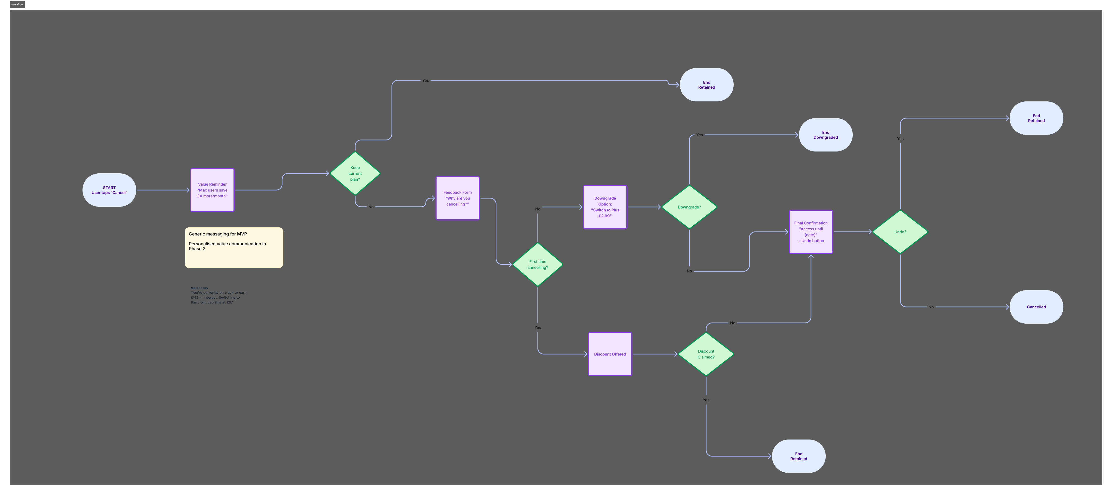
Value-first, not friction-first. Four screens, four goals: understand value → consider an alternative → tell us why → leave cleanly. One UI, two tier-based content variants, so both share a single structure instead of splitting into two flows.
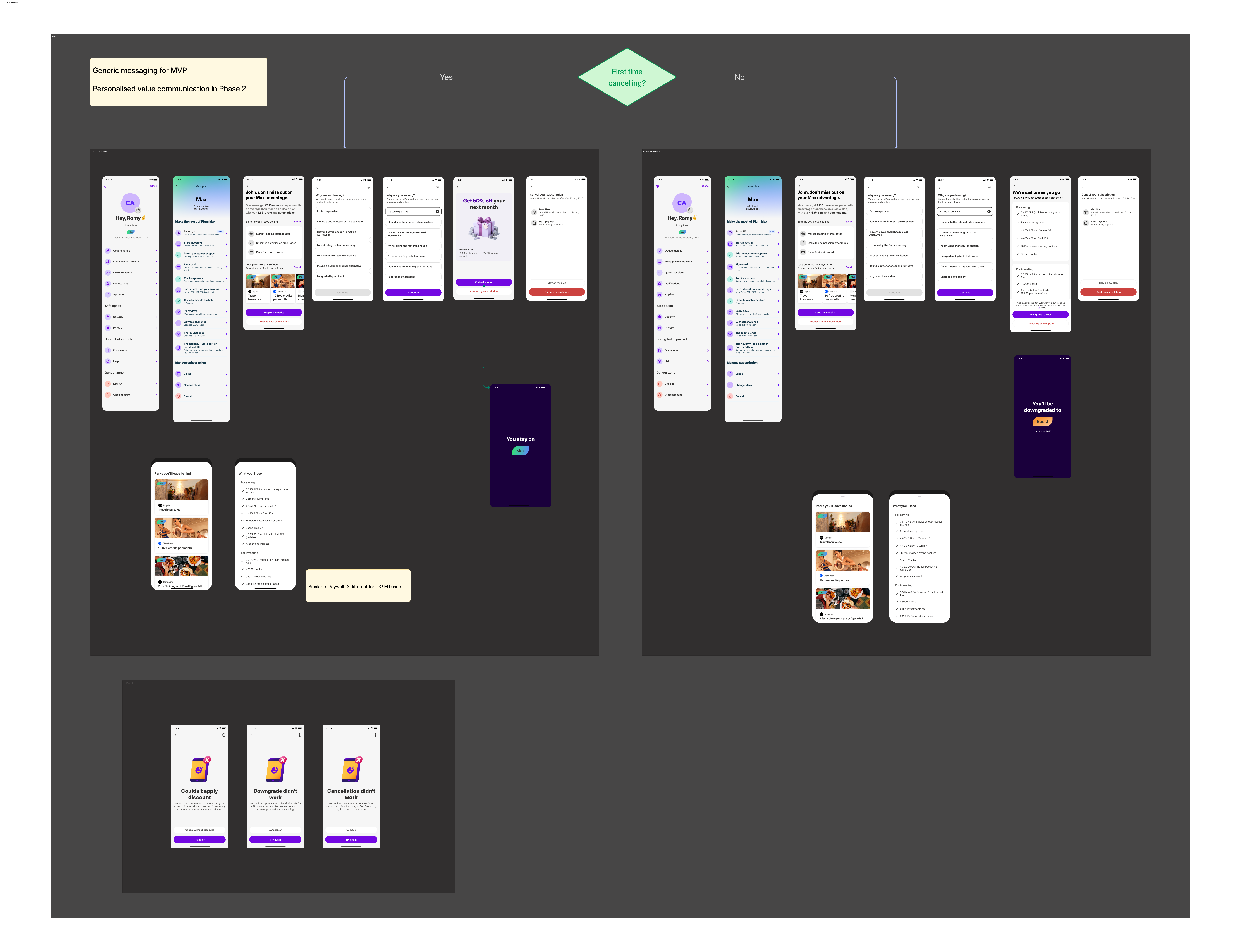
Mapping every branch, Keep, Downgrade, Confirm Cancel, first meant the logic was settled before a single screen was drawn.
Show users what they're already getting before asking them to reconsider anything.
Offer a genuinely lower-cost path where it fits the user's situation.
Retention should never depend on making cancellation hard to find or hard to finish.
Marketing advertises £888/year in Max perk value. Rather than putting that number on screen, I built an independent, defensible estimate from realistic usage, because an inflated figure would undercut the trust the whole flow depends on.
2 tickets/month @ £10, approx. £168/year
Worldwide family cover, approx. £80/year
Approx. £60/year
Approx. £40/year
Approx. £120/year
Approx. £468/year for active users, vs. the £888 marketing maximum
~£468/year in realistic value, for £14.99/month, a number I could defend, not just advertise.
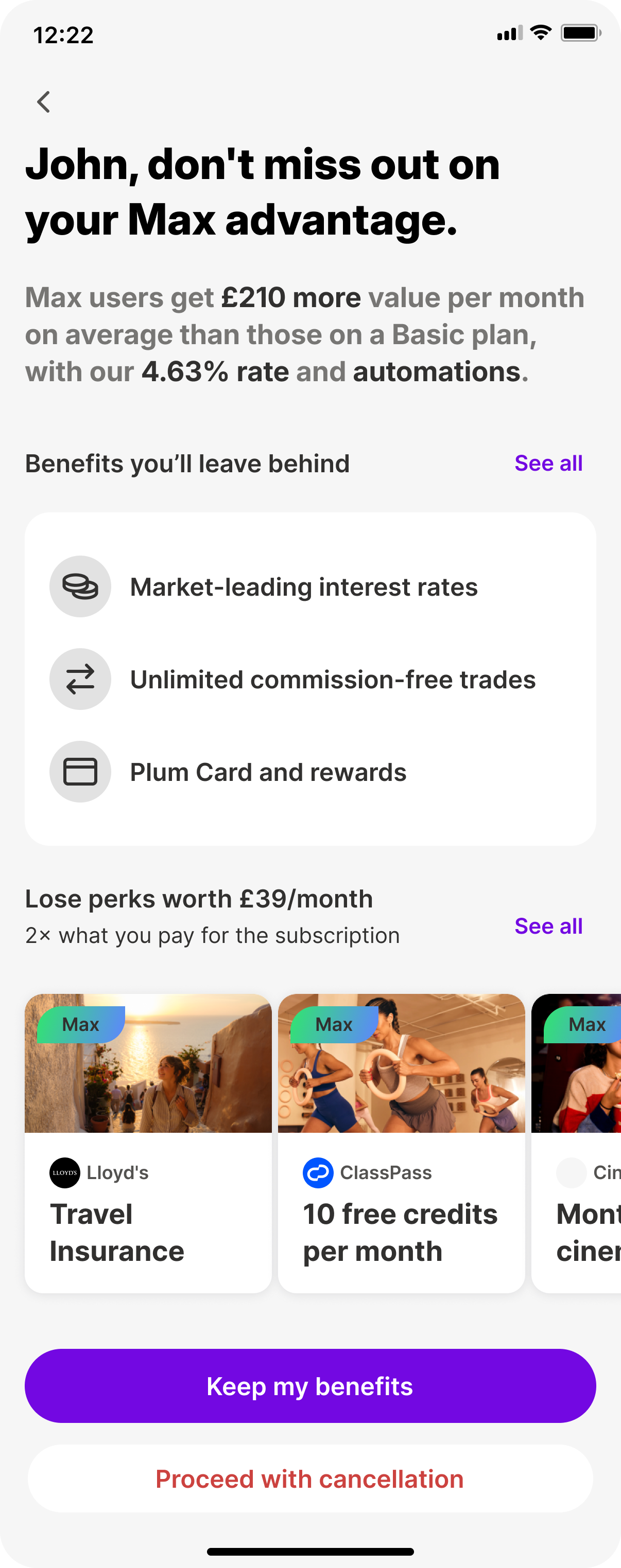
Decision: lead with the user's existing value, not the cost of cancelling. A single tier-specific stat dominates the screen.
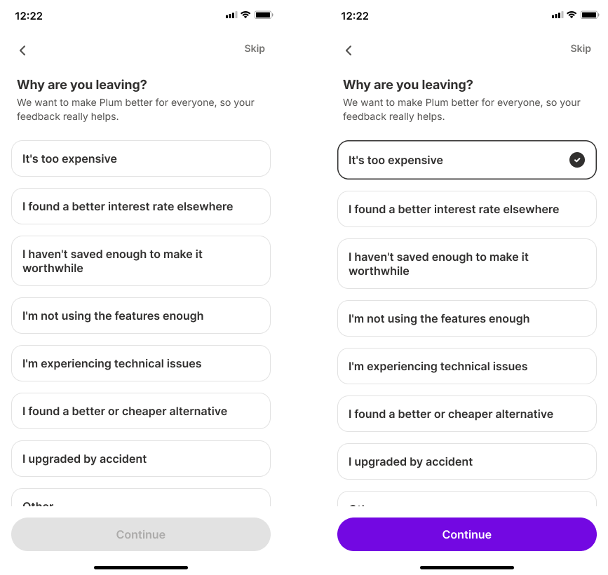
Decision: capture one required reason, too expensive, unused features, bugs, or a competitor, so every completed cancellation becomes labelled roadmap data instead of a silent loss.
Decision: offer a genuinely lower-cost path without hiding the way out. A clear price contrast against a lower tier, plus an optional one-month-free for subscribers who cancel for the first time.
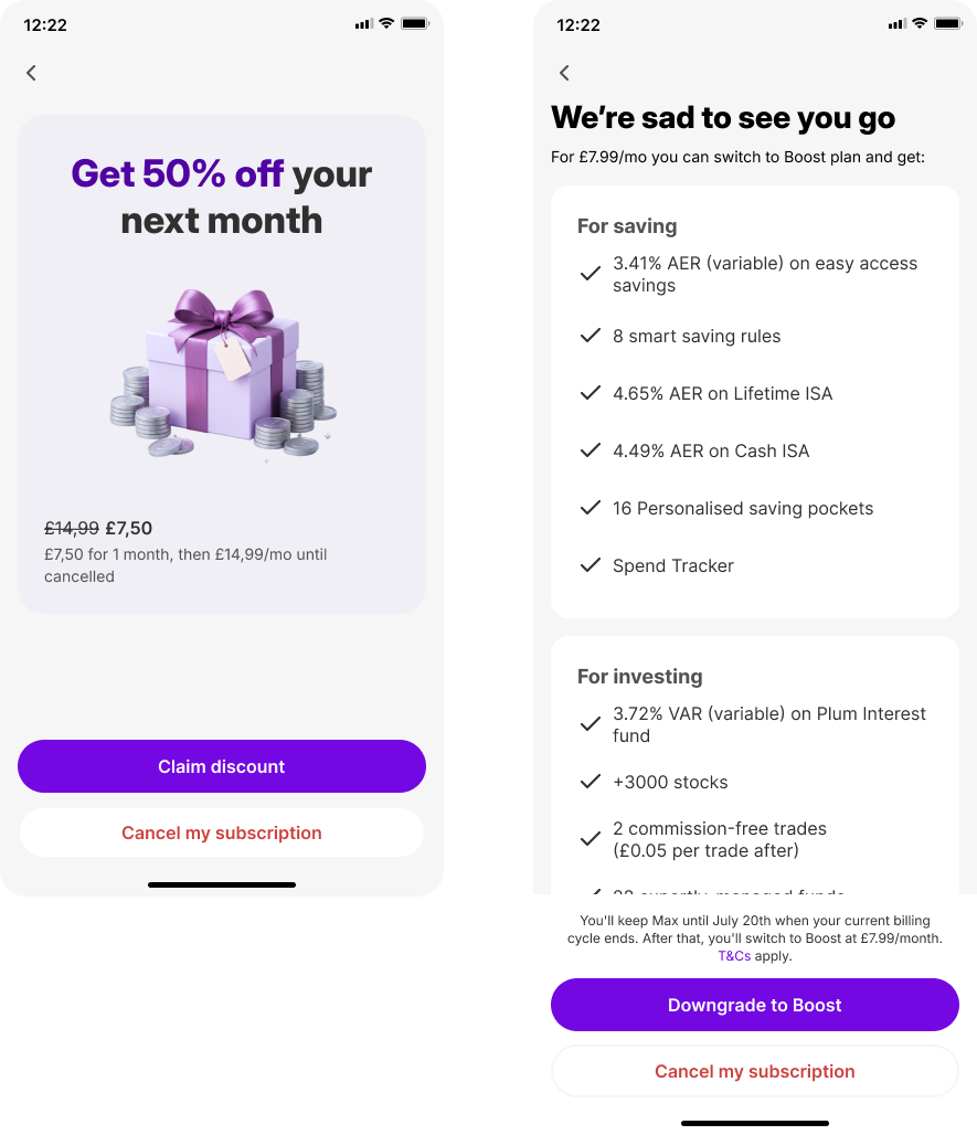
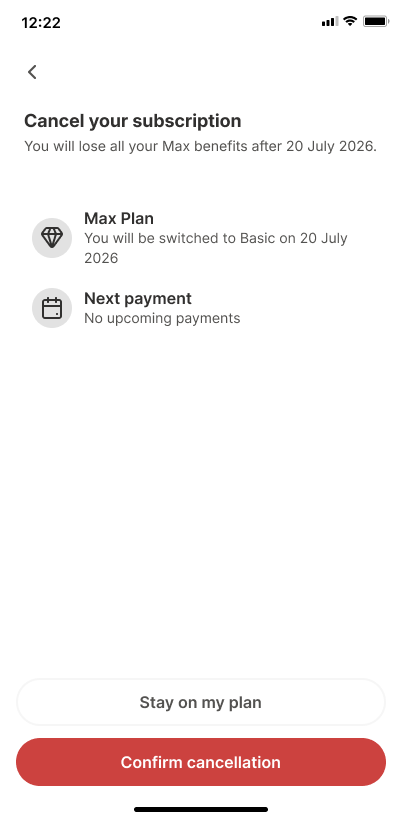
Decision: make the consequences explicit, access continues until billing ends, and which features will pause, then get out of the user's way. A toast and updated profile close the loop, leaving the door open to return.
Full flow
Beyond retention: Plum's first structured churn data pipeline, turning every exit into a roadmap signal.
Reduction in successful cancellations, aligned with fintech industry benchmarks (85% to 75% cancellation rate)
Increased downgrades-over-cancellations, preserving subscriber revenue rather than losing it entirely
The biggest lesson from this project was that retention doesn't have to mean adding friction to the exit. Sometimes the more effective, and more honest, intervention is helping users make a better-informed decision, and being willing to let them go if that's still the right call for them.
Let's have a talk so you can learn more about my work!
© Copyright Ioanna Lazaridou | All rights reserved.